URBS Card Recharge
Design System
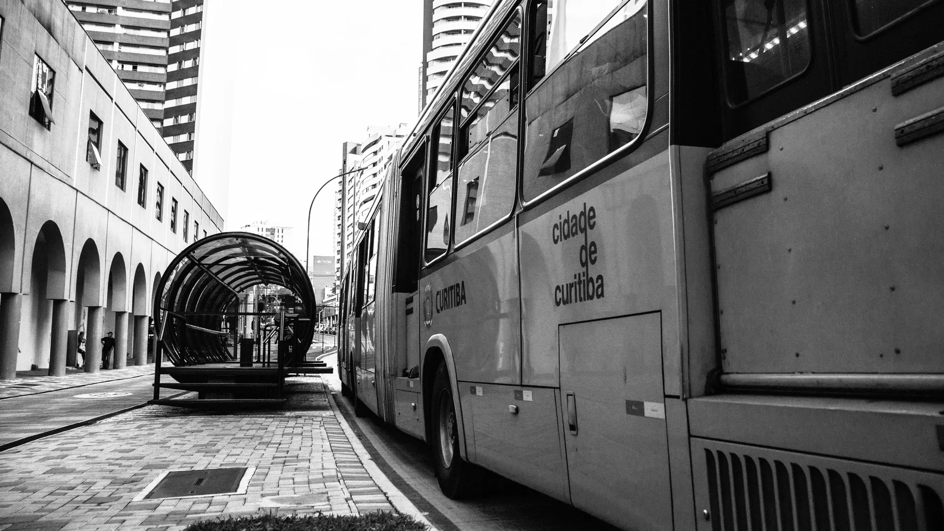
Public-service infrastructure for the city of Curitiba. Three-layer token architecture for a 1920×1080 touchscreen kiosk that recharges transport cards on the BRT bus network, documented and shipped 1:1 with the production app.
1920 × 1080 · WCAG 2.1 AA · PT / EN / ES
Designed and built by Rico Mello · Read the strategic case study ↗
Quick paths
Start from a foundation, jump straight to a component, or grab the token export.
Foundation
Foundations
Tokens, scales and primitives. Open:
Library
Components
Kiosk components shipped 1:1 with production. Open:
Reference
Resources
Layout templates, methodology, token export and changelog. Open: